Every day, humans create about 2.5 quintillion bytes of data! A quintillion is equal to a billion billions. Hard to wrap your head around that number!
All that data may be overwhelming, but the information can be sorted and used to understand our world. In our information age, data organization and analysis is a powerful tool that allows us to draw conclusions, kind of like putting pieces of a puzzle together to see the bigger picture.
Data is often organized in graphs or charts for analysis.
At the MagLab, scientists collect massive amounts of data from samples studied in high magnetic fields. They plot the data in various ways including line graphs, bar graphs, and pie charts, with help from complex computer programs.


Various charts and graphs visualizing and communicating results of MagLab research.
Graphs and charts help us understand information visually. Different types of graphs are used to show different kinds of data. Bar graphs compare different measurements using bars, line graphs show how things change across a range with connected dots, and circle graphs, or pie charts, show parts of a whole.
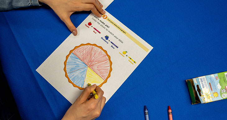
A pie chart gets its name because it looks like a pie cut into slices. The whole pie represents all the data, and each slice shows how much of the whole is taken up by a specific category.
To learn more about sorting and visualizing data, you can make your own pie chart!
What You’ll Need
- Our Pie Chart printout, or create your own
- A handful of volunteers to take your survey
- Crayons in at least 3 colors
What You’ll Do
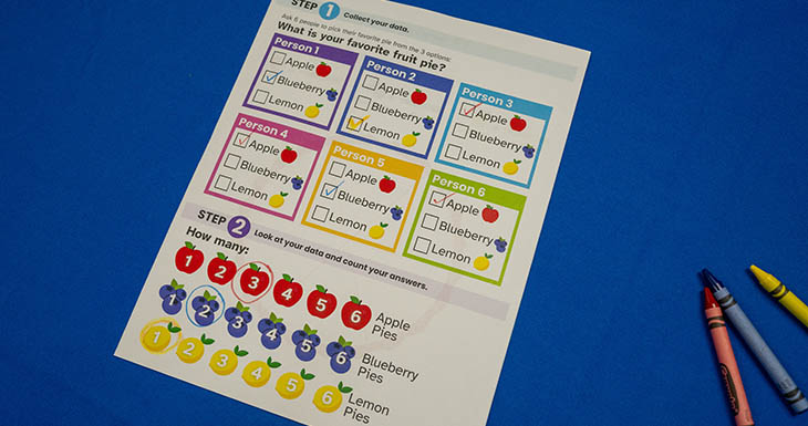
1. Find lots of family and friends to ask a simple question— “What’s your favorite type of pie?”
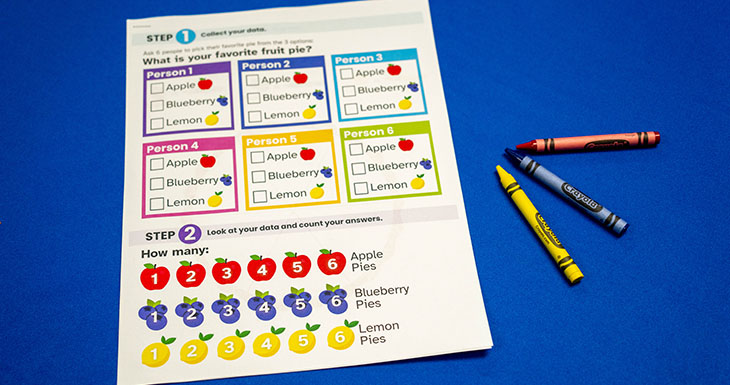
2. Write down the results of your survey.

3. Plot your results on the pie chart. Each slice should reflect a type of pie and the number of people who say it’s their favorite. The pie pieces should be sized in proportion to the numbers.
4. Try other survey topics for different pie charts
Here are a few suggestions, or you can come up with your own:
- Favorite ice cream
- Favorite family tradition
- Favorite type of pet
- Favorite game
Did you Know?
- The pie chart dates back an 1801 publication by Scottish writer and economist William Playfair.
- Nursing pioneer and activist Florence Nightingale is credited with adapting pie charts in the 1850’s to make them more readable, leading to their wider use.